
Overview
<!-- My Role & Scope -->
Led UX redesign from discovery through validation
Conducted heuristic review and stakeholder interviews
Restructured information architecture and booking workflows
Designed wireframes and validated usability improvements
Collaborated closely with engineering on feasibility and rollout
<!-- Context -->
<!-- Objective -->
<!-- Key outcome -->
<!-- Challenge -->

Old Design - Homepage
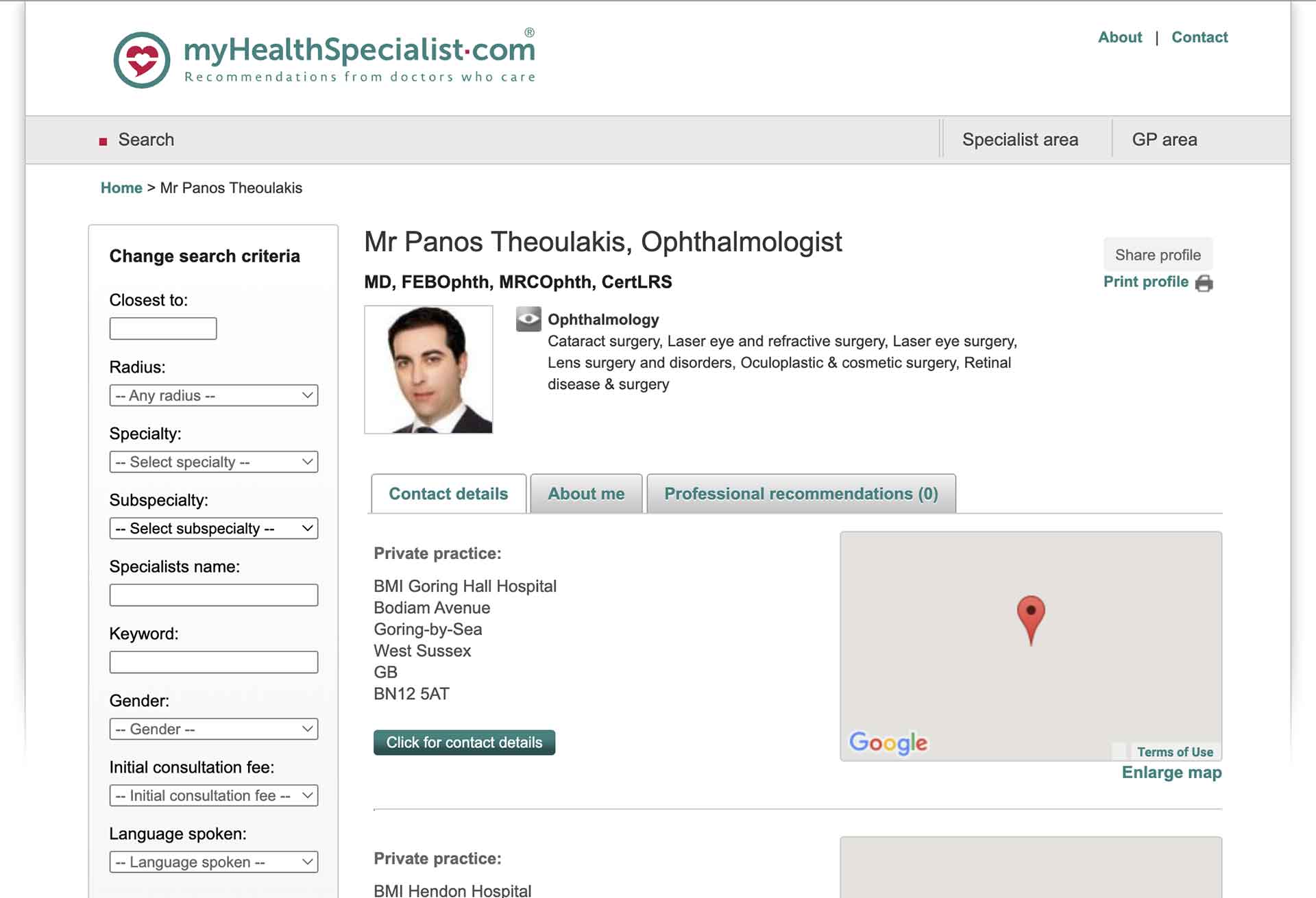
Old Design - Doctor's Profile Page
The process
<!-- Analysing the competitive landscape -->

<!-- Understanding the user -->
<!-- Journey & Friction Points -->
We mapped the journey to identify where hesitation increased and trust weakened.
This mapping directly informed structural changes.
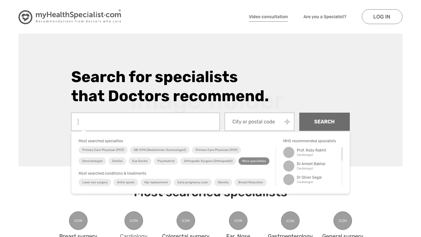
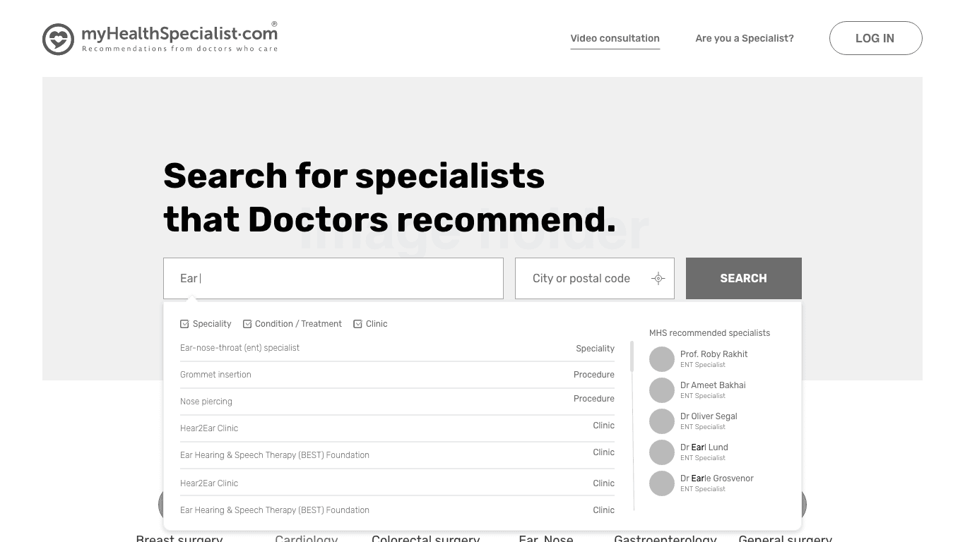
Search
Users needed immediate access to relevant specialists
Filtering had to feel simple and intuitive
Compare
Doctor profiles required clearer credentials, reviews, and signals of legitimacy
Book
Confirmation states needed to be explicit and reassuring
Payment and scheduling steps required transparency
Post-booking
Users needed clear confirmation and follow-up communication
<!-- Mental Model->

<!-- Lean UX methodology->
Rather than a large upfront redesign, we adopted a lean validation cycle:
Formed hypotheses around friction points
Rapidly prototyped improvements
Conducted usability walkthroughs
Measured task time, completion and drop-offs
This allowed us to validate behavioural improvements incrementally.
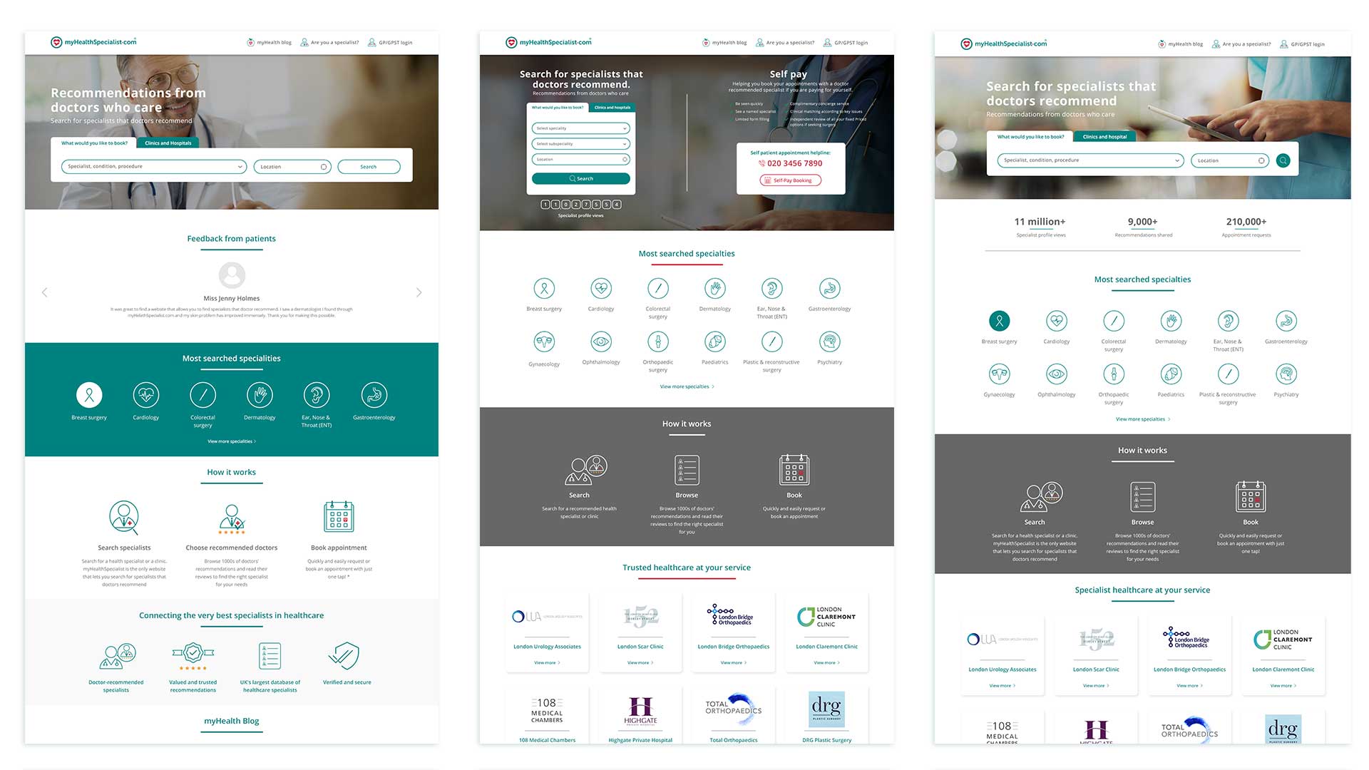
A few iterations


<!-- Solution -->
The redesign prioritised clarity and reassurance over visual enhancement.
Key improvements included:
Increased prominence of search on homepage
Introduced specialty icons for non-terminology users
Improved booking confirmation visibility
Added progress indicators and clearer CTAs
Strengthened profile transparency (credentials, reviews, affiliations)
Simplified mobile booking experience
<!-- Reflection -->
This project reinforced how anxiety-driven contexts demand clarity before aesthetics.
If extended further, I would continue tracking:
Time-to-book
Drop-off at confirmation step
Repeat booking behaviour
The central insight: In high-stress healthcare journeys, trust and clarity drive completion more than visual polish.