Client
Performance Pro
Role
Lead UX Consultant

The intro
<!-- Role -->
Lead UX Consultant – Enterprise Workflow Audit & Strategic Proposal
Conducted a comprehensive UX audit of the performance management platform, including heuristic evaluation, stakeholder interviews, internal user testing, and prototype-based validation. Delivered a structured improvement roadmap aligned with compliance workflows and usability metrics.
<!-- Objective -->
Diagnose workflow friction in the performance review process and propose measurable improvements to increase completion efficiency and reduce cognitive overload in a compliance-driven enterprise system.
Reduced cognitive load in a mandatory enterprise workflow through structured UX intervention.
<!-- Key outcomes -->
(Note: Findings based on internal testing with 12–15 agency participants, including HR, managers, and ICs familiar with performance tools.)
Key Outcomes (Prototype Validation Phase)
40% reduction in Time-to-Value (TTV) during task walkthroughs
Task completion improved from 72% to 94% in mock review scenarios
SUS improved from 62 (below average usability) to 85 (excellent usability range)
Reduced user hesitation across structured review steps
These results validated the proposed workflow restructuring prior to implementation.

Old Design
Recommended Design
<!-- Challenge -->
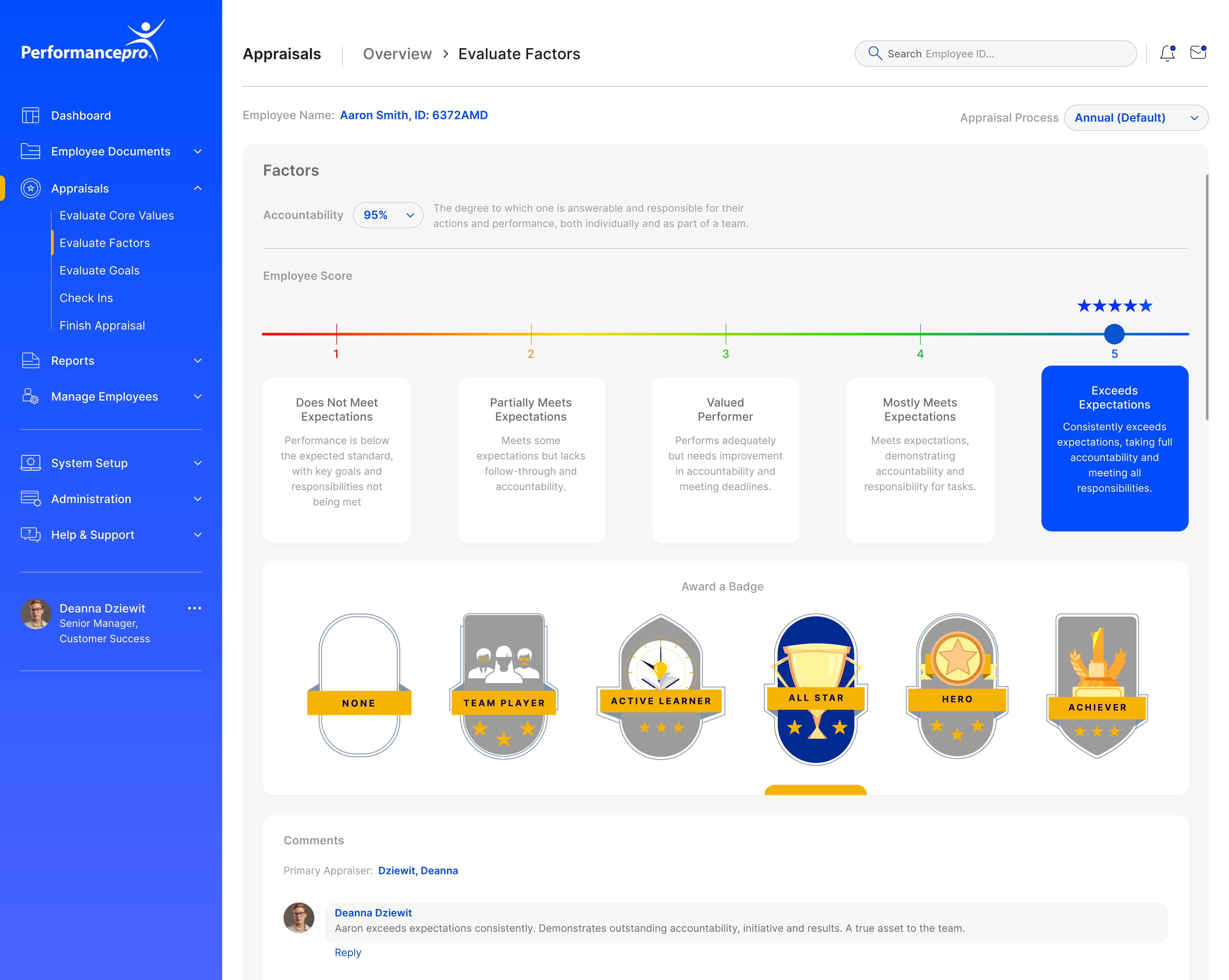
The performance review system was feature-complete but cognitively overwhelming.
Users struggled with:
Navigation ambiguity
Form overload
Poor progress visibility
Weak system feedback
Lack of workflow structure
Since performance reviews are mandatory and time-bound, usability friction directly impacted completion efficiency and HR operational overhead. The challenge was to simplify a compliance-driven workflow without removing functional depth.
The process
<!-- Workflow pattern benchmarking -->
Reviewed publicly available documentation, product demos, and enterprise workflow patterns in comparable performance management systems to identify common structuring approaches.
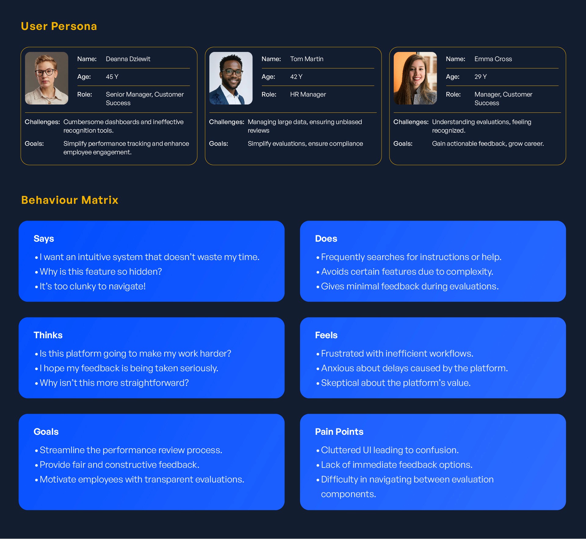
<!-- Understanding the user -->
Interviews and internal walkthroughs revealed:
Managers were goal-oriented and time-sensitive
Employees felt overwhelmed by lengthy form structures
Users needed clear visibility of progress and completion status
Many hesitated due to uncertainty about required vs optional inputs
This highlighted cognitive overload as the primary usability barrier.
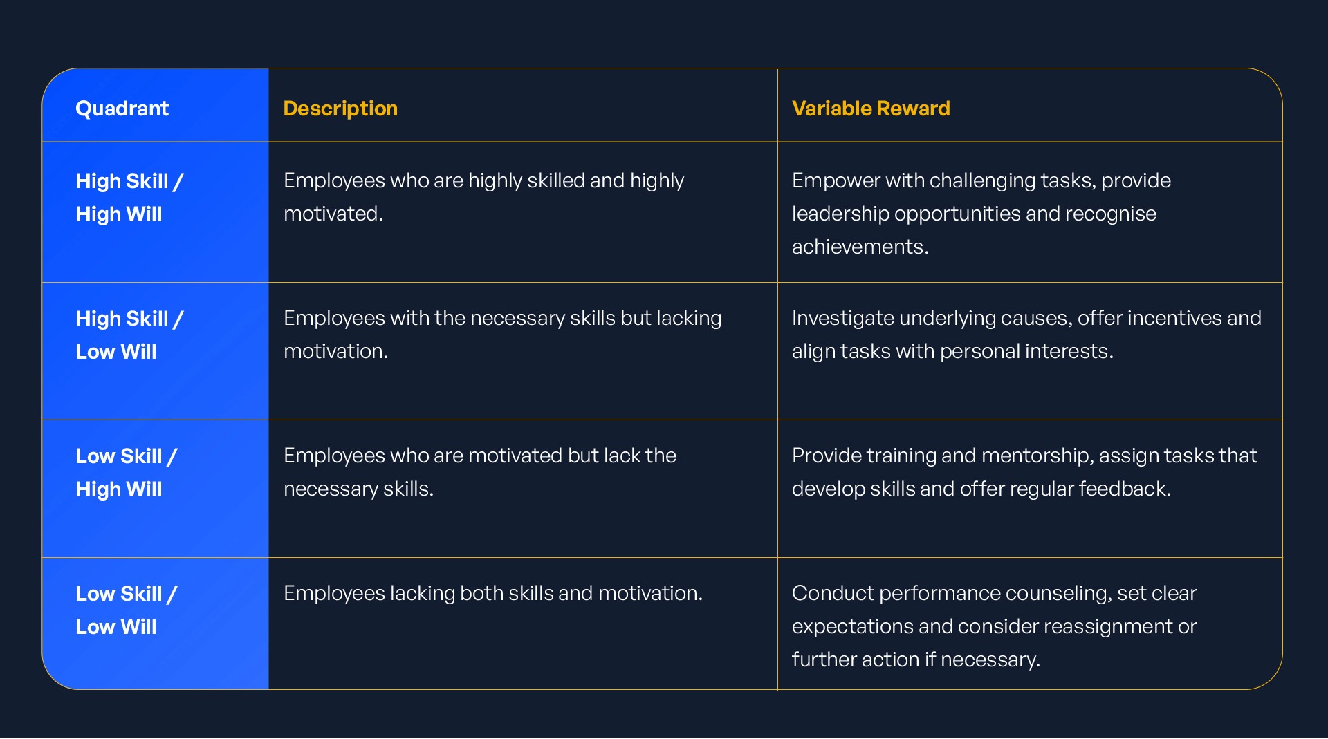
<!-- Skill - Will Matrix->
Mapped users across:
Skill (system familiarity)
Will (motivation to complete review)
This helped identify:
High-skill / low-will users who needed efficiency
Low-skill / high-will users who needed guidance
Low-skill / low-will users who needed structured prompts
The redesign proposal accounted for varying levels of user maturity.
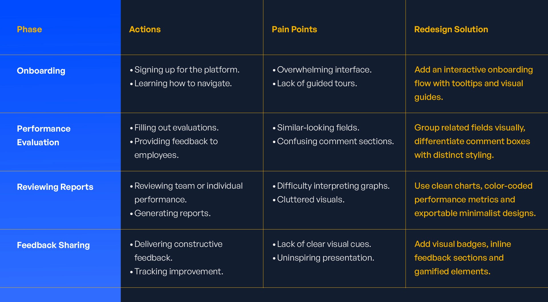
<!-- Customer journey-->
Mapped the end-to-end review journey to identify:
Entry friction
Form fatigue zones
Decision hesitation points
Submission uncertainty
The most significant friction occurred during mid-review sections where users lost progress visibility. This directly informed step-based restructuring.
<!-- Solution -->
Recommended restructuring the review experience around:
Step-based segmented workflow
Persistent progress indicators
Clear section grouping
Simplified field hierarchy
Explicit submission confirmations
Progressive disclosure for advanced inputs
The proposal prioritised clarity and task guidance over aesthetic refinement. Prototype validation confirmed significant improvement in usability metrics prior to implementation.